At Stroud Brewery, we’re often asked about the origins and local significance of our logo. So, here’s the story behind it, and how it connects us to Stroud’s past and present.
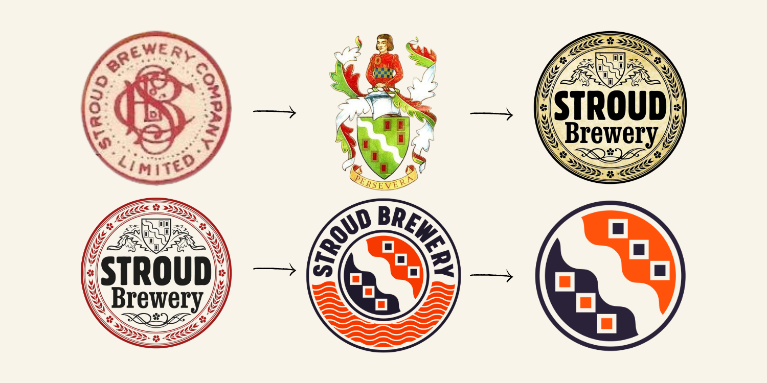
The Old Stroud Brewery Company Logo (Top Left)
Back in 1960, the original Stroud Brewery Company Limited (1760-1967) marked its bicentenary by commissioning a Grant of Arms for the Urban District Council of Stroud. The company’s artist, Mr A. D. Cook, who was also a member of the Heraldry Society, was asked to design the new Coat of Arms.
His design captured the essence of Stroud, the surrounding hills, the flowing streams, and the town’s proud cloth-making heritage that helped put it on the map. (See top left of the image above.)
The Landscape and the Cloth Industry
The abundance of clean water in the valleys made Stroud a magnet for weavers. Over time, the town became famous for its exceptional-quality cloth, especially the vivid Stroud scarlet used in British redcoat military uniforms.
If you visit the Museum in the Park, you’ll find a painting showing a view from Rodborough Fort of red cloth spread across green fields or hung from tenterhooks on wooden frames to dry. (See top middle of the image above.)
This scene inspired Mr Cook’s shield design:
- The silver wavy band represents the water that powered the mills and shaped Stroud’s growth.
- The green stands for the lush valley fields.
- The red rectangles symbolise the scarlet cloth drying on the hillsides.
(See top middle of the image above.)
A Nod to History: Dick Whittington
Stroud’s roots stretch deep. In the fourteenth century, it was just a small village within the manor of Lypiatt, its main church in Bisley. Then, in 1395, the manor passed to Richard “Dick” Whittington, the legendary figure who became four times Mayor of London.
The Whittington family stayed closely tied to the town, even being buried in the local chapel. To honour that connection, a knight from the Whittington family was included in the crest, alongside the motto PERSEVERA - a nod to Whittington’s success through perseverance. (See top middle of the image above.)
Reviving the Name (Top Right)
When Greg Pilley founded the new Stroud Brewery in 2005, he wanted to re-establish a brewery that truly belonged to the town. The name “Stroud Brewery” still carried meaning for local people, evoking memories of its heritage and community role.
In recognition of that history, the shield from the original crest was incorporated into our new logo. (See top right of the image above.)
Over time, we introduced colour variations for our pump clips and bottle labels to help distinguish our growing range of beers. (See bottom left of the image above.)
A New Era of Brewing
By 2008, we were brewing our first organic beers, and a decade later, we took a bold step - becoming a fully organic brewery, using barley grown mostly in the Cotswolds.
In 2018, we also became a certified B Corp, joining a global community of businesses that balance profit with people and the planet.
The following year, we moved into our current home, complete with a large taproom and expanded brewing capacity. As our beers began reaching drinkers across the country, we decided to revisit our brand and logo once more.
The Contemporary Stroud Brewery Logo (Bottom Middle)
We wanted to put Stroud firmly back on the map, not just as a beautiful place, but as a hub of creativity, sustainability, social reform, and community spirit. Whilst holding on to our roots, the aim was to keep that sense of reassuring heritage and trustworthiness that’s long been part of Stroud Brewery’s identity, while evolving it to reflect the modern craft beer scene and the values that guide us today. Our logo needed to capture not only who we are locally, but also our belief that what we do here in Stroud can have a positive impact on the wider world.
The design continues to represent water, fields, and cloth hanging on the hillsides, while concentric circles nod to Stroud’s industrial heritage. They mirror the raised details found on old cast iron works, like the original Budding lawn mowers once made right here at the Phoenix Foundry, the very site of Stroud Brewery today. (See bottom middle of the image above.)
A Logo that Feels Like Home (Bottom Right)
We’re proud of how our logo has evolved while staying true to its roots. The core elements of the original crest now form a kind of Yin and Yang - a balanced, holistic whole, greater than the sum of its parts, and that is Stroud! (See bottom right of the image above.)
It’s a symbol of heritage, sustainability, and community, and we couldn’t feel more at home in it.
